Xero · Fintech · 2026
Faster, simpler invoicing for small business owners
Overview
A self-initiated redesign of two parts of Xero: the Home screen and the Create invoice flow, built as a working, clickable prototype. It follows Daniel, owner of a small appliance store that sells only to other businesses. He sends 60–80 invoices a month. For him, invoicing is how the business gets paid.
The problem
Xero’s current invoice flow makes it easy to
leave invoices unsent and miss who still owes you
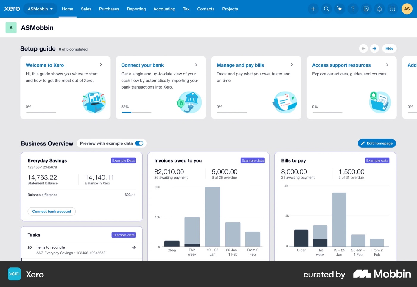
Posts on Xero’s product-ideas forum, Capterra and NerdWallet reviews, and a step-by-step review of today’s invoice flow using Claude kept pointing to the same three problems.
Unsure what was sent
“Save & close” looks safe but leaves the invoice as a draft, and there’s no clear sent state.
What users sayBuilt for accountants
Account codes, a global tax switch and “Approve” language push owners into mistakes.
What users sayNo view of who owes
Picking a customer doesn’t show what they owe, what’s overdue or their credit limit.
What users say
The solution
A Home that shows who owes you,
and an invoice that can’t be left unsent
Each problem got a direct answer. In the same persona walkthrough with Claude, the average score went from 3.1 to 4.5 out of 5.
One goal: Review & send
No draft dead end. A clear sent state, tracking from Sent to Paid, and Undo.
Defaults, not accounting
Tax is set once and account codes are filled in automatically, so the bookkeeper still gets correct books.
Who owes you, while you invoice
The customer card shows the balance, what’s late and the credit left, live.
Research
What owners need,
and what Xero needs
Using Claude, I researched both sides: what small-business owners need from accounting software, and how Xero makes money.
User research
The 10-second test for an owner’s Home screen
- 01Who owes me, and who’s late?Total owed, overdue in red, the late accounts with one-click Remind
- 02How much cash do I have?Bank balance and its lowest point ahead
- 03What’s coming in and going out this week?Invoices and bills due in 7 days
- 04Will I be OK?A 30-day cash forecast
- 05What needs me today?A short list of tasks, each with its action
- 06Do the thing I came forNew invoice, one click away
Business research
How Xero earns
- SubscriptionsA monthly plan. The cheapest one allows only 20 invoices a month, so busier businesses pay for a bigger plan
- PaymentsA fee on every invoice paid online. Xero bought the payments company Melio in 2025 to grow this
- Add-ons & partnersPayroll, projects, lending and the app store
Growth now comes from earning more per customer, and the invoice flow is where subscriptions and payments meet.
KPIs the redesign targets
- Drafts that get sent
- Review & send
- Unsent-draft check
- Time to send
- Only required fields
- Tax in one place
- Days to get paid
- Overdue in red
- One-click reminders
- Paid online
- Pay online on by default
Process
Score every step,
then fix the lowest moments
I couldn’t test with real users, so I used Claude to review the current 15-step invoice flow with a persona walkthrough, scoring how confident the user would feel at each step, from 1 to 5. The three lowest moments became the redesign priorities.
1. Research
Owner needs and 14 finance apps, with Claude and Mobbin.
2. Explore
Two options for Home and two for the invoice flow.
3. Review
Claude walked each screen as the persona and scored it 1–5.
4. Iterate
Three rounds of fixes, then a working prototype.
Current Xero · create invoice, 15 steps
Average confidence 3.1 / 5 → redesign 4.5 / 5
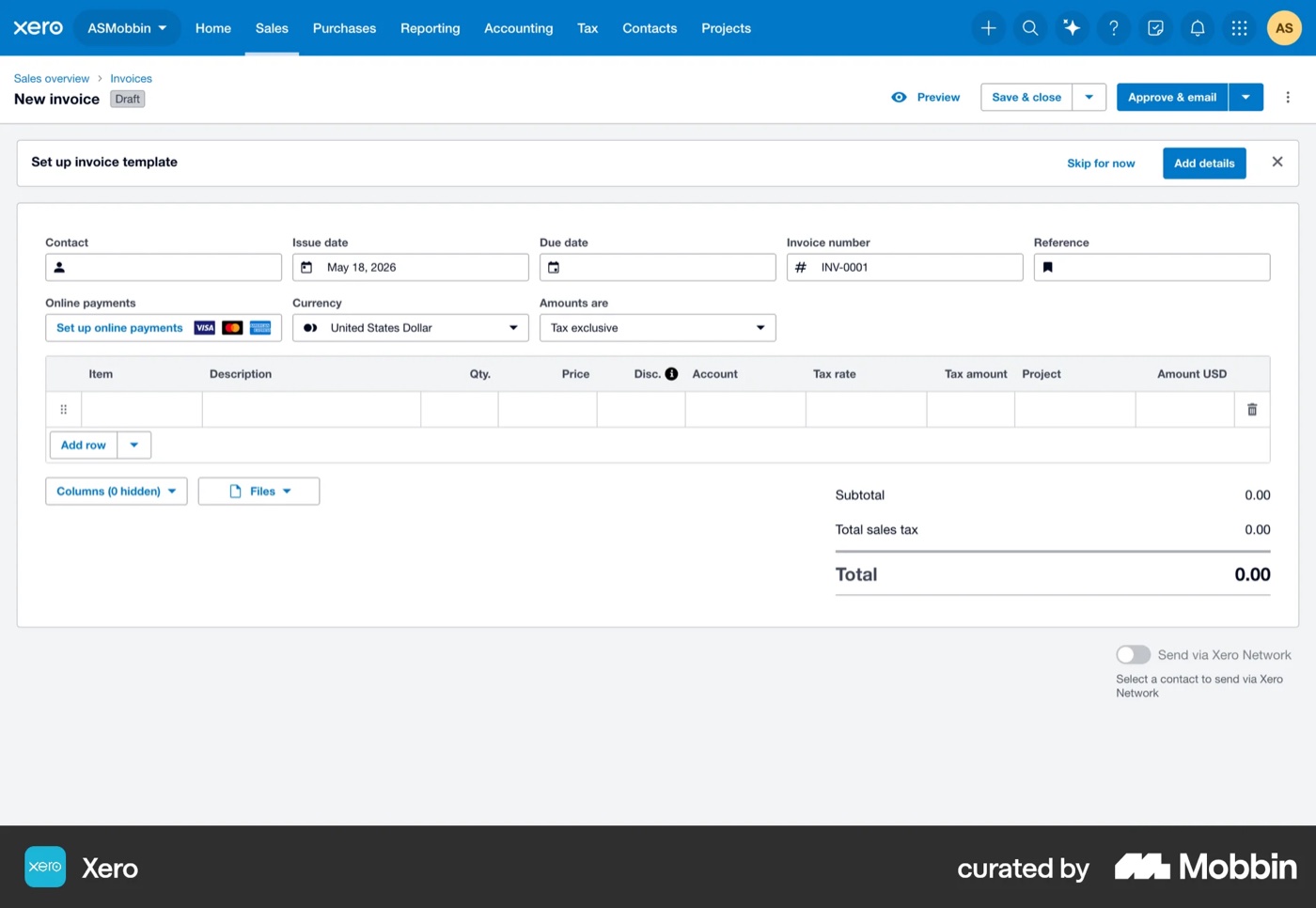
Step 3 · 2/5
An overwhelming blank form
9 header fields and 11 columns before typing anything, and no field marked as required.
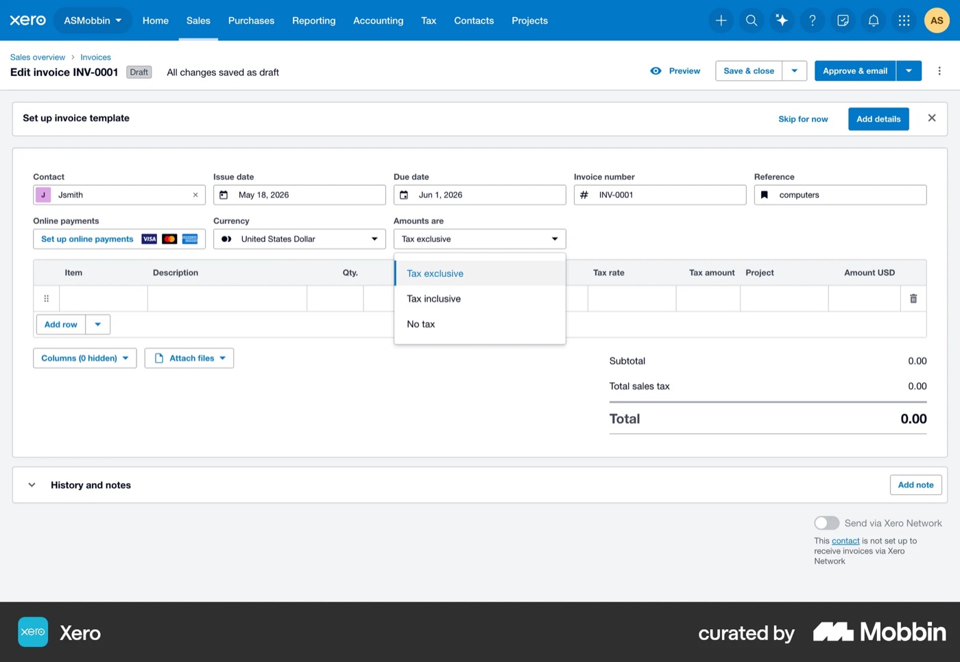
Step 9 · 2/5
A global “Amounts are” tax switch
Tax exclusive, inclusive or none, for the whole invoice, with no explanation.
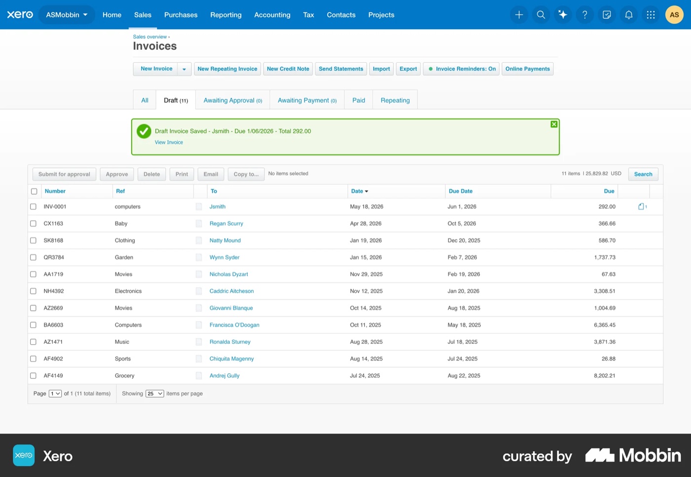
Step 14 · 1/5
“Save & close” is a dead end
It looks safe, but leaves the invoice as an unsent draft in a list of 11 others.
Home
From a report to
“what needs me today”
Money owed comes first: how much, what’s late and who to remind, each with one action. The cash forecast and today’s tasks sit beside it.
Invoice flow
One page, a live preview, one goal
A full-page editor beat a three-step panel: it’s faster at 60–80 invoices a month, and the live preview catches mistakes.
Customer
Catch the duplicate before it happens
Picking Oakridge Kitchens, one of Daniel’s customers, flags its unsent draft, with three clear choices. Then the customer card shows what they owe, how late they pay and their credit.
Details & items
Only what’s required, filled in for you
The customer’s order number (PO) is required, tax is set once for the whole invoice, and every change updates the preview and the credit left.
Review & send
Know it was sent, and undo it if you need to
A “Ready to send” checklist and the exact email the customer will get. After sending, a progress line from Sent to Paid, and 30 seconds to undo.
Reflection
Designing for the owner,
not the accountant
Most of the fixes made Xero simpler: owners can see if an invoice was sent and who owes them right away. Claude made it fast to research and review every step, but it can’t replace real users. Next I’d test the flow with five trade-business owners and measure the KPIs from the research.